Monday 8 May 2017

Scenic Art - Study Task 6.5 - Art Styles

Study Task 6.5 - Romanticism Artist
I have chosen to focus on this image for my look into the Romantic art movement because, to me, it perfectly encapsulates the movement itself. The textbook definition, which, admittedly, did come from wikipedia is that the Romanticism focuses on the individual and the "glorification of the past". Théodore Géricault
Raft of the Medusa
Gericault was a French Romantic painter active during the early 1800s. The picture on the right depicts the failing craft of the ruined Medusa Voyage. It is arguably his most famous picture that I first became aware of after I attended a lecture on the period.
The picture itself depicts the "starved" and tortured survivors of a shipwreck. The picture was shocking at the time due to it's inclusion of women in such a time of horror and dismay, which I think adds to the emotional impact of the image as a whole as it shows that everyone was affected, and not just the "hardy" mean.
I think it fits the whole notion of Romanticism because it focuses on the trauma that these few individuals endured. I also feel that it glorifies the whole event because it puts forward this image of people who are reaching out and not yet given up hope and descended into madness. The bodies of the pictures themselves are still very muscular despite the weeks of starvation they endured,


Sunday 7 May 2017

Scenic Art - Lessons 2 + 3 - Lesson Notes and Study Tasks

Bark Texture
Creating the Texture

Materials Used
Wooden board
Flintex
Sand
Gravel
String

Tools
Graining Comb
Pointed Sash Brush


Process
A fairly large amount of Flintex* is mixed with varying amounts of sand and gravel. This creates an uneven, rough base texture to work off of. Using a brush of your choosing (we used pointed sash brushes), you are now able to coat your set piece with a thin layer of your mixture. You can then run a graining comb brush horizontally across the piece, which begins to create the uneven ridges often seen on bark. This is repeated several times until you are happy with the result. I also included several lengths of string for added definition and texture. Although not included in my work, it is possible to create a knot effect by building up your mixture in a rough circular shape. Jamie created this effect and used string to help define the general shape of the knot. I thought this was a fantastic effect when trying to create realistic trees. To complete your base, you may want to add some more sand/gravel to create a more tactile finish.


Brickwork 
// Alternatives Expense, less freedom
Vacuum form - Peter Evans Studio
Tools
Gridle Scraper
Masking Tape
Tape Measure

Materials
Idendon
Sand

Process
To begin creating brickwork some reference material is needed. For this project we used pre-made vacuum formed brick as our reference to work from. Once your measurements have been obtained you are able to start marking out the brickwork. Between each row and brick, the scenic artist needs to leave a one CM gap that will represent the cement. This cement line is then covered with a strip of double sided tape.
Similar to creating bark, a base texture is created by mixing idendon with a variety of scatter materials until the required texture is obtained. Unlike with bark, a smoother texture is often required for brick work. To achieve this we ran gridle scrapers across the wooden board until we reached the ideal surface state.
Note! There is a lot of variation between bricks so some work will require more smoothing and less sand, while others will need more sand and less smoothing. For example, Jamie wanted quite a rough texture that imitated the brickwork outside so he created a much grainier base of idendon to work from. He then didn't spend as much time smoothing the bricks down. This creates a much older, cracked effect that could work well if the scenic artist is trying to replicate older buildings.
Once you are happy with the surface texture the tape is removed and the brickwork is left to dry so it can be painted.

Painting the Bark


Paints used
Rosco Paint - Yellow Ochre
Rosco Paint - Raw Umber
Rosco Paint - White
Rosco Paint - Black

Process
When painting your bark it is a good idea to start with light colours and work your way up to the darker tones. This creates a sense of depth within the texture. To paint my bark texture I began with an extremely watery layer of yellow ochre before slowly adding bits of raw umber and black to give it its darker overtones.


A Notes on Paints
Rosco Paint - 1:1 or 1:2 water ratio is required


"It is a durable product only marginally less tough than Idenden Brushcote"

Bristol Paints
Bristol Paints have a much weaker pigment and can be
Texture Guns
For large scale scenic texturing it is helpful to use a texture gun, which coats large areas of your set with texture quickly and efficiently. When using a texture gun it is important to load it with thinner versions of idendon and flintex in order to ensure that the gun does not clog.

https://shop.flints.co.uk/Products/pg_Pliable_Coatings/PATFHS810
£51.45 - 10L


Vacuum Forming - Peter Evans Studio
Durable, clean look, built in fire retardant chemicals, flexibility and speed of production
Vacuum forming offers a more even and clean cut look.

What is Vacuum Forming
"Vacuum forming is a simplified version of thermoforming, where a sheet of plastic is heated to a forming temperature, stretched onto a single-surface mold, and forced against the mold by a vacuum." - Direct definition from Wikipedia.
Q1) What is the purpose of applying texture to stage sets?

Q2) Find two examples of stage sets that utilise texturing. How do the scenic artists achieve this effect?

What do you think is effective?

Rock Face

Cliff face

Tree?

Rust
Q3) Find a few examples of both man-made and natural surface textures. How would you reproduce these textures?

concrete - sand and flintet.


I would attempt to recreate this wall work combining pebbles with idendon. Once an initial base had been applied to the set I would then paint over the texture with a thinner version of the flintex used in texture guns in order to give the final piece a slightly smoother finish. 
Once the texture had dried I would use a mixture of orange and yellow paint to get the yellowy orange tint as seen in the image. I would use rosco paint because I would be able to water it down more to create the paler, more washed out colour towards the bottom of the image. I would then build on this layer using the same paint mix to create the stronger tones towards the top. I think I'm quite fortunate in that there is a gradual transition between the colours as it means I am able to wash the colours in more gradually. I feel like there would have been more room for error if I attempted to use this method for a stronger paint tone.


I would attempt to create this texture in a similar way to how the brick work texture is created. 


Les Miserables
Due to the uneven and slightly rough texture of the brick pillars I would use idendon to create the effect because it would be easier to shape and give a sense of age. I personally think that vacuum forming would appear too pristine and clean cut. The pillars are also relatively thin so I think I would struggle to cut and stick the vacuum forming together in a way that looked realistic and natural. On the other hand, I think that the scenic artist could get away with using vacuum forming for the circular door way and wall to the because it has a much cleaner look.


 Year 2 - Design in Action Project

Cobblestone
Grave Stones
The grave stone was made by creating a polystyrene base to the rough size and then covering it in idendon


Scenic Art - Painting the Floor Cloth - Study Tasks 4 + 5 + 6.5 + 7

Study Task 4 - Laying a Floor Cloth
Laying the cloth
Tools and Materials

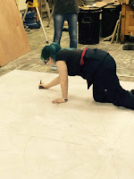
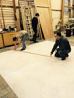
To begin laying the floor cloth, the cloth is first laid flat out flat over the floor. The top end of the cloth is identified by a seam that runs across its length. Once the top end has been found two people are required to start nailing it into the floor. If the scenic artist is unable to nail into a floor for any reason (concrete, workshop rules...) they would then construct a wooden frame to hang the cloth on.
To secure the cloth into place the centre point is first identified and the first pin is hammered in. Working outwards in from this point one person will hammer the cloth into place and the other will pull it tight to remove any creases. Each pin should be placed roughly three inches, or the width of three fingers, away from the last one.
Once the top end of the cloth has been pinned into the place, the two scenic artists will move on to the opposite end of the cloth before pinning the left and right respectively.
Note! It is important not to hammer each pin completely into the cloth to allow the area around the pin to be painted. This is also true if you are hanging a cloth on a painting frame.

Study Task 5 - Differences in Painting

The ups and downs of Floor Painting
Benefits
I personally find that I have more control when facing downwards
The entire cloth is easily available
Paint doesn't drip
Downfalls
Every one walks all over it - Can get quite crowded
Dirty - mud and dust easily covers it
Extended periods of time on your hands and knees can put a strain on your body
Can't project image easily on it. This limits the scenic artist to plotting and the grid method.


Ups and Downs of Hanging 
Benefits
Death
Less of a strain on the body
The scenic a
Problem Areas
Sponging and blending
I found my specific
Knowing exactly where to put the frog tape.

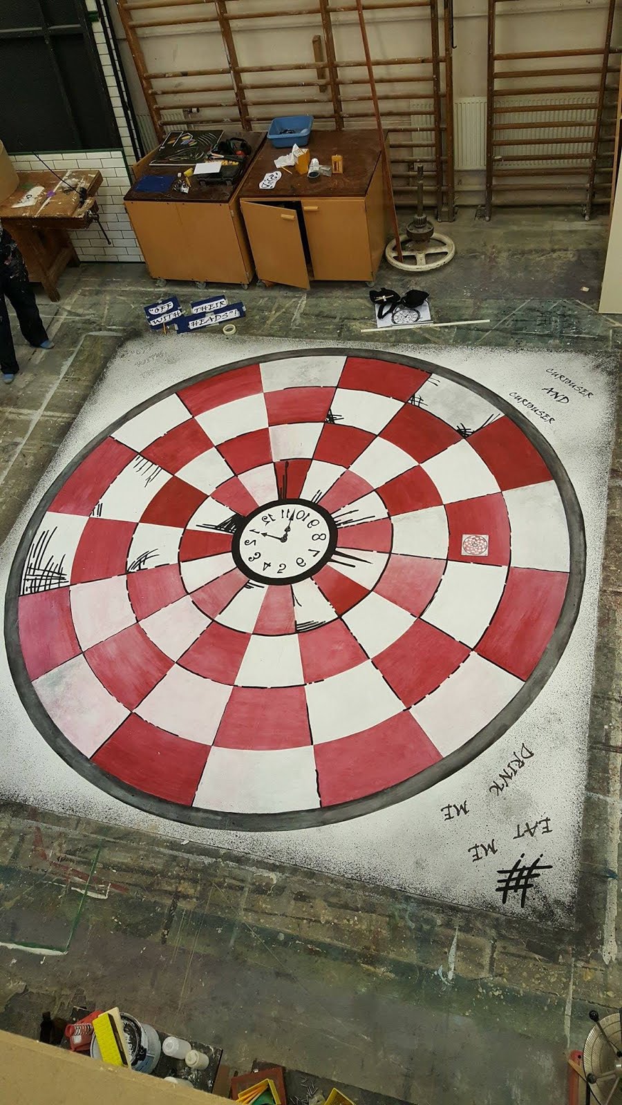
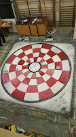
Study Task 6 - Process of Painting - Alice in Wonderland

Figurative Drawing Step 1
Priming
Before the scenic artist is ready to transfer the design onto the floor cloth, the floor cloth first needs to have a base coat of white paint applied. This is especially important if the cloth has been previously painted, which ours was. Unfortunately I was AWL (away with leave) during this period so I was unable to properly experience this step. However, we did something similar to the flats we used for the end of year project for which we first applied a light layer of white paint. This serves the purpose of both hiding any previous work and making it easier for the paint to grip onto the surface. For this project we used Rosco's saturated white paint because it has a much stronger pigment that leads to a much whiter and thicker finish.

Step 2 - Plotting
Tools and Materials
Pattern
Snap Lines + Pounce Power
Flogger
Pencil
Frog Tape
Compass - Plywood, Drill
Tape Measure
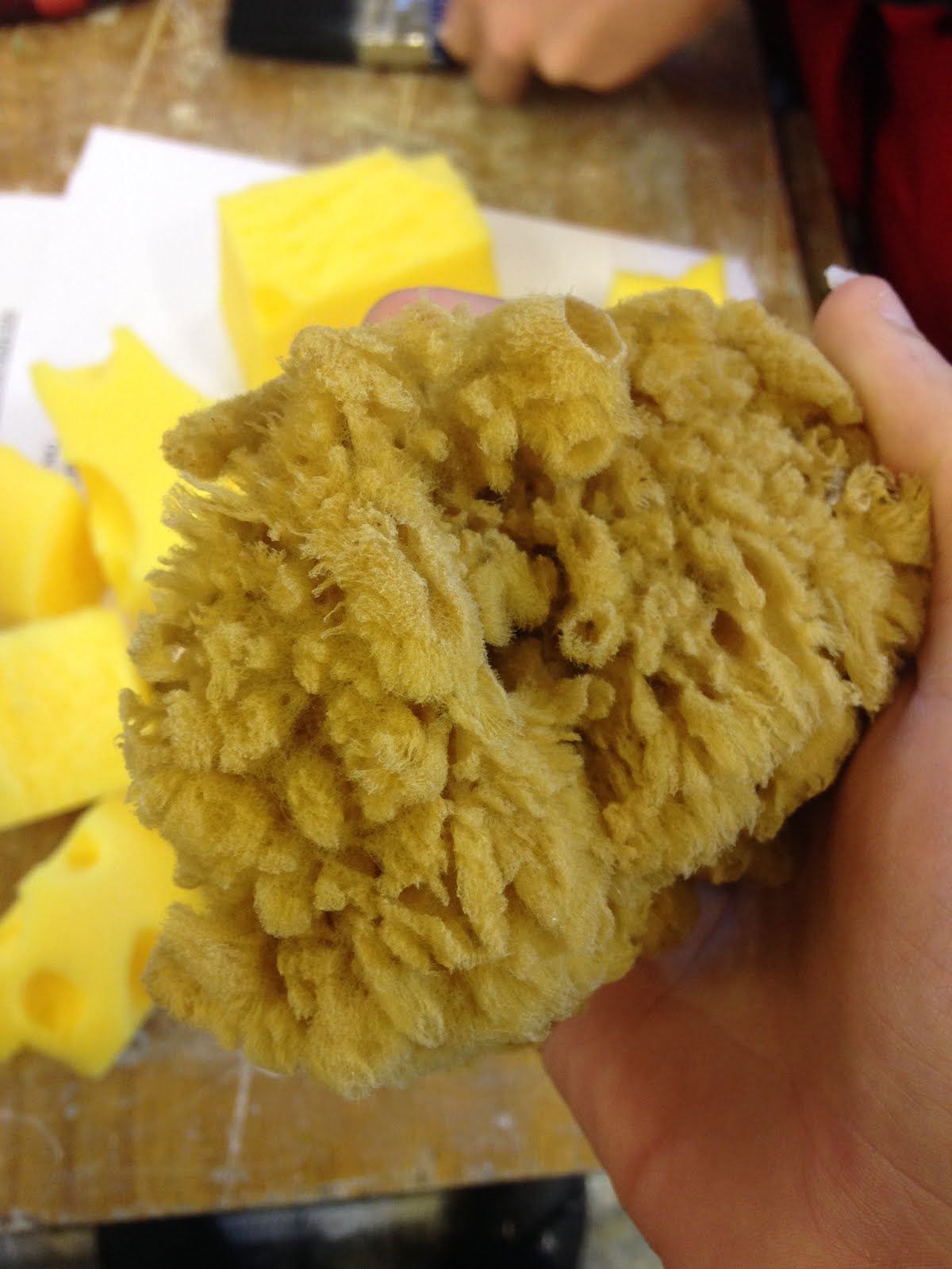
To try and construct the perfect circles around the board we constructed a massive compass out of long and thin sheet of ply and drilled holes through at the correct radius for the circle. A pencil would then be inserted into each hole individually. One person would then stand in the absolute middle of the circle while the compass monkey would run in circles along the outside and pray that both ends of the circle met up, which luckily, they did. Once we had our rough circles complete we used snap lines and pounce powder to cut up the circles into segments.
The problem with using pounce powder is that it leaves a dusty residue and that can mix with the paint and cause it to become dirty. To avoid this, floggers can be used to get rid of all the excess graphite. This can become quite tiring and I would avoid doing it for any extended periods of time.
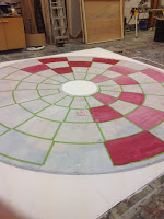
Once the basic outline of the shape had been achieved we used frog tape to place lines over the white squares. This served to highlight the correct areas to paint red and meant that an jolts with the paint brush would not spill out over the white squares.


Step 3
Painting

Step 4 - Writing and Clock Work
Tools
Pencil
Carbon Paper
Masking Tape

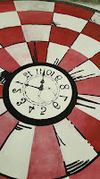
When writing out words onto a floor cloth we discovered that the best way was to use carbon paper to transfer the design directly onto the cloth.
To do this the writing is first printed to the correct scale before being taped to the mat side of the carbon paper. The scenic artist then traces along the outside of the writing, which hopefully should leave a faint outline on the cloth. I initially struggled with this as I found I was touching far too lightly and could barely see the lines I had done. This was easily fixed by pressing down more with the pencil and by going over the lines with a pen. Once all the outlines have been covered in the carbon paper, the carbon paper is removed and the outlines were filled in using black permanent marker, which I think gave the final piece a much inkier and illustrative feel.
This method was also used in the marking out of the cloth. I think that this was the best method for the cloth because the projection would be unfeasable and the curves would have been too difficult to draw free hand.


Study Task 7 - Other Methods of Transferring Designs

Carbon Paper
When transferring writing, the scenic artist has two main options
Transfer paper - Black and white - Better quality, more expensive, larger sizes for larger transfers
Carbon Paper - Cheap, only A4, can only be used on harder surfaces- polystyrene is a no go.

Projection
An alternative route to take is to scale the original image up using a projector and then position the larger image onto the surface that needs painting. This is a quick and easy method of transferal that allows the scenic artist to recreate the original art exactly to designer's specifications.
I have used projection as part of my work for the immersive theatrical experience You Me Bum Bum Train in which we projected the Passenger's signature onto a fake check as part of a scene. While using this method we positioned the projection onto a wall and held the check in place while the other volunteer copied the signature onto the check. A downside I noticed to using this method was that a lot of the quality was lost in the process of blowing up the image. This was largely an issue with the small size of the signature and the great size we were blowing it up to. Additionally,  However, due to the speed at which the passengers progressed through the scene it would have been unfeasible to use the grid method each time and we would have lost accuracy because it would have been impossible to recreate the original signature exactly. A further downside to using this method is that is that it is much more reliant on technology than the grid method. We continuously faced problems with the projector and computer not working, which meant that we were unable to continue at some points and had to use our best guess. Unfortunately, no pictures are available for this example as we were forced to agree to absolute secrecy to the actual scene content.

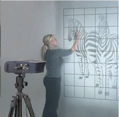
To the right is a fantastic image of a scenic artist using projection to quickly and easily map out the image of a zebra.


Image References
http://art.emich.edu/news/tech-talk-5-artograph

Scenic Art - Study Task 1 - 20/1/16

Scenic Fitches
Scenic fitches are used for the majority of artwork requirements in scenic painting. In particular, they are most often used for line work and offer flexible control.
They can be attached to sticks to allow the artist to work on backdrops at distance.
They can come with flat, rounded or angled bristles. Although some scenic fitches can appear similar to the pointed sash brushes, they can be identified by their long, thin handles
Pointed Sash

Pointed sash brushes have a rounded copper ferrule and are cut at an angle all round. They are usually  fairly multipurpose but are most useful for drawing lines of any kind. In addition to creating lines, they can also be used in dry brushing to give off a weathered effect.
Foliage Brushes
Foliage brushes are perfect for creating an earthy foresty effect. 
Softener
Stippler
Stencil Brushes
Stencil brushes are used in a -------------
Sponges - natural and artificial
Sponges can be artificial or natural. Natural sponges have a more uneven and bumpier texture, shown with the blue paint above. while artificial sponges typically offer more uniform, finer textures, as pictured in the blue. The effects can range from delicate finishes to bold and striking areas. It can be a inexpensive method to cover large areas quickly.
Sign Writing Brushes
Sign writing brushes tend to have longer bristles, which offer more flexibility and control over movement. Pictured above is my attempt at using a sign writers brush to write out my name. I found this task brush slightly more difficult to work with as I am not used to calligraphy or working in great detail. 
Stamps
Stamps are an incredibly quick and effective way to create repeat patterns. They are ideal if the scenic artist wants to create geometric shapes, flowering and lettering. From my own experimentaion with stamps I have discovered that I may be the only person incapable of using them. My first attempt ended in disaster after using too much paint and my second one didn't go much better. 
Graining brushes
Graining tools
I found the graining brushes to be reasonably effective but had a little difficulty getting the paint ratio ratio correct, which affected the neatness of the grain and knot. I also had some trouble with the rocking motion used to imprint the knot but I think that was just lack of practice and I will improve over time. I tried with a few different tools and found the pictured tool to be the hardest to use as I couldn't get the rocking movement right. 
Rollers - textured

Pressure sprayers

Techniques
Blending
Spattering
Puddling
Cross Hatching

I used these brushes to achieve this effect

Not much on tools. All 14 techniques, what brushes?

Role of the Scenic Artist
Extra
Extras - Scenic Painting

Woman In Black
I thought the scenic painting added to the overall moody and bleak atmosphere. Some sharkstooth gauze separated the stage, which blocked out certain elements to be revealed later, and was painted to look like a stormy sky. This could also be an example of scenic painting used to distract the audience of other effects/locations until they become relevant. I think that this feature set the tone for the play and added to the overall sense of dread and moodiness. It also worked well with the with the dim lighting, which increased the effect.
My guess at how they accomplished the effect is using stippling brushes to due to the immense size of the netting in order to add the darker colours, before using brushes to add the lighter colours and then sponges to blur out the lines and create the cloud like effects, similar to how I created the water sprays for the end of year scenic art project. I would use Rosco paints when creating the gauze as I would be able to create a much more watered down wash, similar as to the one seen in the picture.
Sidenote! Credit for the picture goes to Iona.

Peter Pan
This was a low budget youth theatre production so they couldn't create an expensive set. To enhance the idea that they were on a magical, far away land they painted the backdrop to look like a boat on clear water. They also added three dimensional  elements like a mast to give some depth to the sight. I think that this was a brilliant idea as it further separated the scene from the real world and created the image of an island. It is also a great example of incorporating scenic painting into the actual set in order to increase immersion.
If I were to attempt to recreate the backdrop I would first attempt the grid method before blocking in the main colours and then adding the detail. This is because the backdrop covered the entirety of the stage and I feel projection would be too difficult to get the correct scale. However, after looking at Ashleigh Wheeler's second year scenic art project that she somehow managed to do with minimal gridding, I think that it would be possible to come up with a final outcome without the need of all the intensive background work. Additionally, the image she came up with happens to be fairly similar to the backdrop of Peter Pan so it shouldn't be too hard to use similar methods. To create hers she began by initially painting a small version of the final piece before free handing it onto the flats with pencil. She is, however, an apparent pro so I may suffer more difficulty.

Scenic Painting - Study Task 2

Scenic Paintshop

Royal Academy of Art
Full Disclosure - I lost the sheet I did the work on so I went on Jamie's Blog to refresh my memory. I double checked everything and changed what I thought was incorrect. There were also a few I thought fit both. For example, it is both a requirement that the workspace has electrical sockets but it is an electrical component, 

Every Scenic Paintshop requires two distinct areas, one for the painting to take place and the other for correct storage.

The Workspace

2) Adequate ceiling height, which will exceed the highest pieces of scenery when standing up. 

3) Large, smooth, wooden-floored space devoid of any obstructions such as pillars or low ceilings 

4) A permanent or fold-away drawing table in a clean and dry environment for looking at technical drawings and displaying the set model/art work 

5) Ideally situated close to the stage area if in a Theatre environment

6) Plenty of space to move scenery around easily and view work in progress.  

7) Good number of power points and a system of power points suspended from the ceiling is ideal. 

8) First Aid Kit, Fire Extinguishers & Waste Disposal 

9) A pneumatic system for air supply or portable compressors. 

11) Scenic Paintshops often have multiple projects going on at the same time, for this reason it is important for there to be plenty of space to move the scenery around and look at it.

The Sink and Paint Mixing requirements
 
1) Large sink with excellent drainage.

2) Hot and cold water supply. 

3) A large mixing table placed in a position of excellent light and situated near the sink. 
Paint manufacturers colour charts and information for visual reference. 
 

4) System for hanging up wet brushes and rollers. 

5) A supply of gentle detergents for cleaning brushes, particle soaps, gels and barrier creams for hands.

Wall Space

1) Storage for built scenery to be stacked. 

2) Wooden paint frame fixed to the wall. 

3) Space to build a wooden frame for smaller canvasses/backdrops where an actual paint frame is not present.

Paint & Equipment Storage requirements: 

1) PPE (Personal protective equipment) including respiratory equipment, ear defenders/plugs, gloves and safety goggles.

2) Essential Health and Safety Equipment to be worn in work-space when specified: Overalls/Protective Clothing, Knee-pads, Steel toe-cap shoes/boots and Hard hat

3) COSHH Information and Safety Data Sheets.

4) Plenty of shelving units, containers and a labeling system.

5) Lockable metal cabinet  necessary for the storage of certain paints and any substance known to be potentially hazardous.

6) Ideally a separate room for storing stock paints & equipment.

7) Stock-check lists & Supplier catalogs.

Working at Height requirements

1) A paint gantry or a paint bridge if required

2) Scaffolding paint tower if required A-frame ladders (preferably a selection of sizes)

Lighting and Electronics requirements
 
1) Natural light source for colour matching and mixing paints

2) Artificial lighting in the form of tungsten, halogen or daylight-simulation bulbs
   
Heating, Air and Ventilation requirements

1Good system of ventilation especially vital when using potentially hazardous materials, such as certain glues and paints.

Fan heaters to rapidly heat up a space as well as cool down, when required.  

What is a Scenic Artist
Jose Lerma
Scenic Artist
Scenic artists are primarily responsible for the creation of scenic textures and backdrops for use in theatrical performances. During a production they may be asked to recreate expensive or impractical authentic materials such as marble, brickwork, cobble stone and bark among many others. They often work from design briefs given to them by the production designers of a project. Other responsibilities may include purchasing the paint the paint they to use, base coating/ priming the the scenery, creating aging effects and maintaining the paintwork throughout the performance. Every scenic painter will regularly come into contact with potentially hazardous chemicals, which means that good knowledge of health and safety regulations is required, as well as some basic knowledge of chemistry.
Some of their duties may include
Purchasing the supplies and colours needed for the job
Creating the texture
Priming and base coating
Gridding and marking out the flats
adding in the block colours
Maintaining the paint work for a set

References
http://creativeskillset.org/job_roles/746_scenic_artist
http://theatre.uoregon.edu/production/scenic-artist/


Scenic Art - End of Year Project - Study Task 8

Process of Painting Theatrical Flats
Dorian Spencer Davies


Scaling Up
More often than not, the scenic artist will be working off of art that is much smaller than the flat they will be working on. In our case we were fortunate to already to have the art at 1:10 scale so we did not need to worry about resizing the image to suit our scale. As it was all we had to do was multiply the measurements by ten to get the correct sizes.
The scenic artist first needs to grid the image by dividing it into a suitable number of grids before transferring the same number of grids onto the area they're working.
Grid
Before the scenic artist even begins to start transferring the design from paper to flat, they first need to ensure that, when finished, all the flats line up line up exactly with each other. Group A went for a slightly different method and grid each flat individually by measuring up and along. This led to some difficulty for them later on because not all the flats were constructed to the exact measurements. This meant that not all of their lines met up. Our group once again used snap lines to mark out all flats at once. This meant that all our grids matched up exactly and worked out well for us later on. We once again flogged away the excess graphite.
Plotting
Before the scenic artist can finish drawing out the rest of the art, they need to make sure all interconnecting lines are mapped out first. This ensures that when the flats are pushed together all the lines match up. While performing this task my partner failed to take into account line width and this meant that our boat failed to match up properly.
When plotting out the rest of the image we used scale rulers to scale up the measurements on the original artwork so we could apply them to the flats. While measuring my lines I attempted to always take the midpoint of the paint work so that the brush strokes would match up. However, I did give myself some leeway when I found that using what I thought were the exact measurements came out looking unnatural and inaccurate. Once the base design has been successfully applied

Blocking Colours

Black Lines

White Lines

Details

Colour Mixing
I found the colour mixing the most difficult and time consuming part of the project, sometimes spending up to half an hour attempting to get the perfect colour.
Two examples of the colours I mixed:

Chimney Red
Chrome Yellow, Barbie Pink, Cherry Red, Orange Red

Sand
Brick Orange, Burnt sienna, white,

Evaluation
Despite a panic stricken first two days (and Sunday!) I found that over the course of the project I greatly improved with both my colour mixing and ability to draw more freely. I had initially had it stuck in my head that I had to recreate the image exactly and was almost reduced to a mental breakdown when it came to having to mark out curves of the tree. It was only with the help of a course mate who helped sketch the start of the tree that I realised attempting to copy everything exactly would result in a rigid and unnatural final project. Once I allowed myself a little bit of artistic freedom I found that my drawing became much more fluid, as well as being much closer to the original than it would have been had I overthought all of my positioning.
  • What skills did I learn and develop on the painting project? 
Although I was already familiar with working with scale through a mathematical background I found that my confidence grew much more in actually applying what I learnt in scaling up the original work to the size of the flat. Early on during the mapping out process I feel that I spent far too much time rubbing out and replacing lines. If I were to redo the project I would definitely be more confident in my abilities to draw accurate lines and not have to constantly redo them, In addition to this, I am able to see a definite improvement in my colour mixing as is later discussed. The most important thing I think I would take away from the project is that I am allowed to not worry so much about what I am doing and go with what feels natural, especially in terms of dimensions and colour mixing.
  • How appropriate was my selection of colours and paint techniques in response to the artwork? 
I found that, especially to start with, I was very uncertain with my choice of colours and feared going too dark to the point of no return and this led me to select weaker colours, such as an incredibly light orange when creating the wall colour, which meant that I wasted a lot of paint and time attempting to get to the colour when I could have started off using bolder colour to get a closer colour more quickly and saved myself a lot of time and bother. I also found that I consistently created more paint than I needed to and forever underestimated the power of watering down the paint. 
  • Why is it important when painting that we view scenic artwork at a distance? 
Particularly in regards to the painting as a whole and not just my little section of it, I found it incredibly important to take a step back and look at the whole thing because it is all well and good creating a beautiful path but when that path doesn't match up to my neighbor's it resulted in a much more clunky image.  
  • In what ways, did I take care of the scenic paint-shop and maintain a safe working environment? 
I do feel like I failed somewhat in regards to this part of the project as I think that I could have been more attentive to the space around me. I found it alarmingly easy to lose track of the brushes and paint I was using, which was not helped by the fact that all colours and paints were shared by those throughout the groups. In other ways I would say that I was a bit too attentive in that I disposed of colours that would have come in use later on in the project. This is most evident with the boat work where I got rid of the orange colour after thinking that it was completely finished, when the reality was that the measurements did not match up and an entire section had to be redone. To me, this highlighted the importance of keeping every colour available until you have the finalized version standing before you.